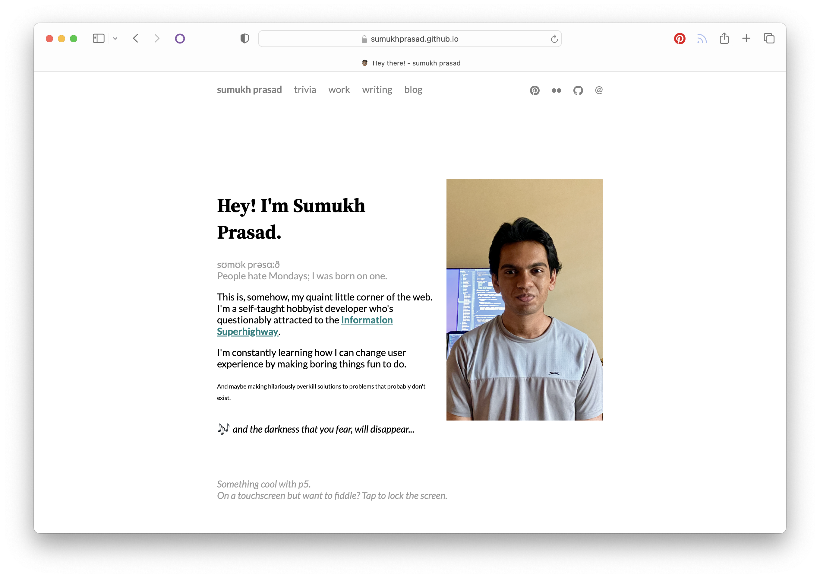
posted on 10 Apr 2025
Redesigning this website
Old-web vibes are cool.
posted on 10 Apr 2025
First, Why?
Creating your own online presence is a tough job. When you’re both client and designer, the highest standards apply. It has to be top notch, unique and inspiring on every level.
— Jorn van Dijk, Made by Sofa
This was the basis for me redesigning this website. The old one was sleek and clean, sure, but it lacked the charm I wanted it to have. I’ve always loved those old-web blogs that seem to have some character to them, like Daring Fireball, The Blogess, Michael Tsai and a whole host of others — so I wanted to have some of that charm shine here as well.
Georgia on my mind (… and Verdana too, maybe)
One of the first things I did was to take out the Lato, Source Serif, and IBM Plex Mono fonts in favour of Georgia, Verdana, and Courier New. I have nothing against those fonts, heck, they’re still my favourite fonts to use on other projects — but I wanted to keep this site “classic,” so to speak. They scream “old web” but in a warm, unpretentious way — these fonts are web-safe and will still render beautifully on basically everything.
Theme color
Now there’s a theme colored body that replaces the white nothingness of yore. It’s subtle, but it serves to emphasize the 640px content width and also makes it feel a lot more cozier and less like a printout.
Pagination
This one’s purely for technical reasons, end of reasons. I am not interested in an unmanagable list of links.
Dates before titles
Purely for the aesthetic. Again, charm is what I’m going for. Also I don’t know, it just feels more blog-ish to me for some reason.


At the end of the day, it’s not beautiful that I’m after — I want a place on the web that feels like me and not a prim-ified me.
Read more —
Changes to this website
4 Apr 2026
Hello, world: Artemis
Home, from a long way away.
2 Apr 2026
Addendum: Apple@50
< all blog